Zenbox Case Study
By Nora Owens
For our Ideation Studio project, we designed a personalized box and a website to introduce alternative treatment options to people newly diagnosed with depression.
Metadata
Course
Ideation StudioDuration
9 weeksTeam
Sam Baker, Nora Owens, Saransh SolankiSponsor
Premera Blue CrossDesign Tasks
Experience Design, Visual Design, Interaction DesignProcess: Research, Ideation, Prototyping, Spec
Research: How can we assist caregivers in the process of finding care?
Premera Blue Cross serves more than 2 million people in the Pacific Northwest and has heavily researched those who need care. They came to us knowing that caregivers are integral in the process of finding care (identifying a need for care and connecting with the right professional), but had yet to delve into the caregiver experience. 16.2 million adults in the United States are diagnosed with depression, but each year 65% of them do not receive treatment.1 We found in our primary and secondary research that many people are diagnosed by their primary care provider, often unexpectedly: they come in for back pain or sleeplessness and come out with a diagnosis of depression.2 Many people also have a disinterest in traditional talk therapy and antidepressants. To complicate this, there are many caregivers who want to help but are unsure what to do.Ideation
We created a suite of 20 concepts in response to our problem statement: How might we assist caregivers of adults with depression in finding care? To provide additional perspective, Premera joined us in reviewing the concepts. Some of our ideas challenged Premera’s existing business model or would require extensive support across the organization, our conversations helped us to understand the feasibility and limitations of these kinds of ideas. We then evaluated each of these concepts in a decision matrix considering the role of the caregiver, consideration of privacy, direct link to a care provider, and ease of use. This matrix helped us to choose the 3 most promising concepts (which we enhanced with features from other smaller concepts).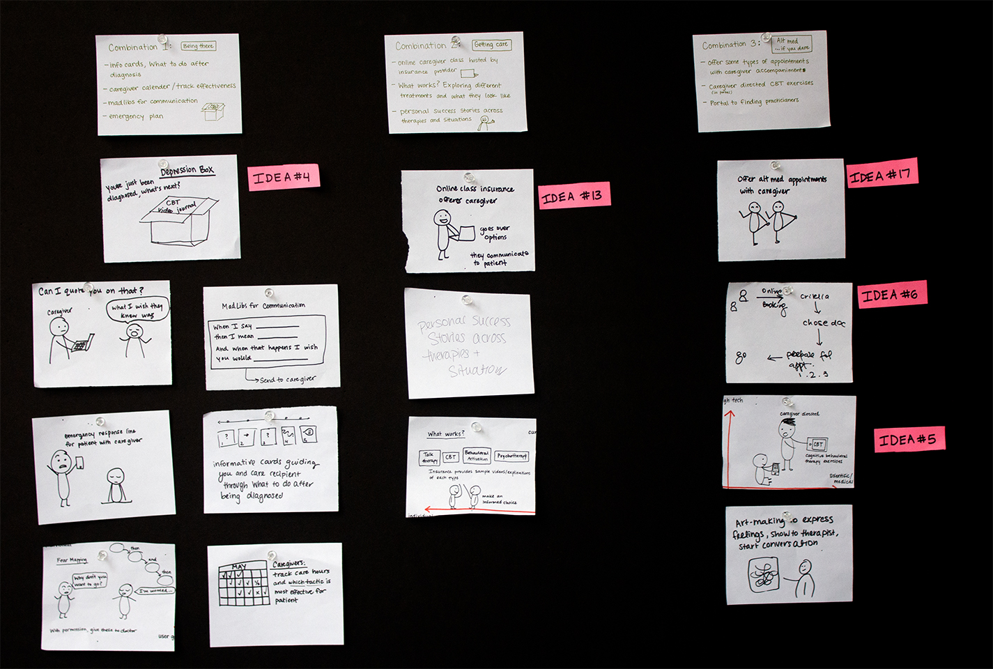 We chose the 3 most promising concepts and storyboarded them to better understand the comprehensive experience of each.
Concept 1
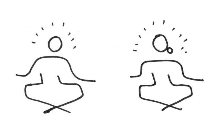 Our first concept was a set of tools for caregivers to learn about Comprehensive Alternative Medicine and connect with providers nearby. Caregivers would be involved with trying new therapies, such as attending the first Yoga Therapy session or trying CBT exercises at home. This option best involved the caregiver and expanded the horizons of what care can be for depression.
Concept 2
 Our second concept was a box, designed as a physical intervention to begin the conversation between loved ones about depression. The box would contain informational cards with tools for communication and emergency planning, as well as uplifting treats. This best addressed conversational needs and proposed the idea of a physical intervention.
Concept 3
 Our third concept was a platform for caregivers to educate themselves about various treatment options. It would transparently outline the costs associated with care options, highlight personal success stories about therapies, and help caregivers understand what their role can be in this process. This best addressed some of the practical mechanisms by which caregivers can educate themselves on the options.
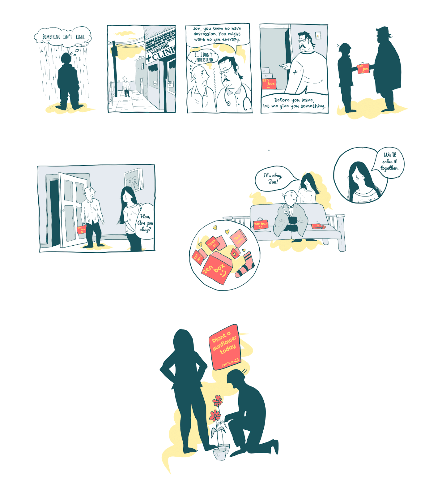
(Storyboard for Concept 1 by Saransh Solanki)
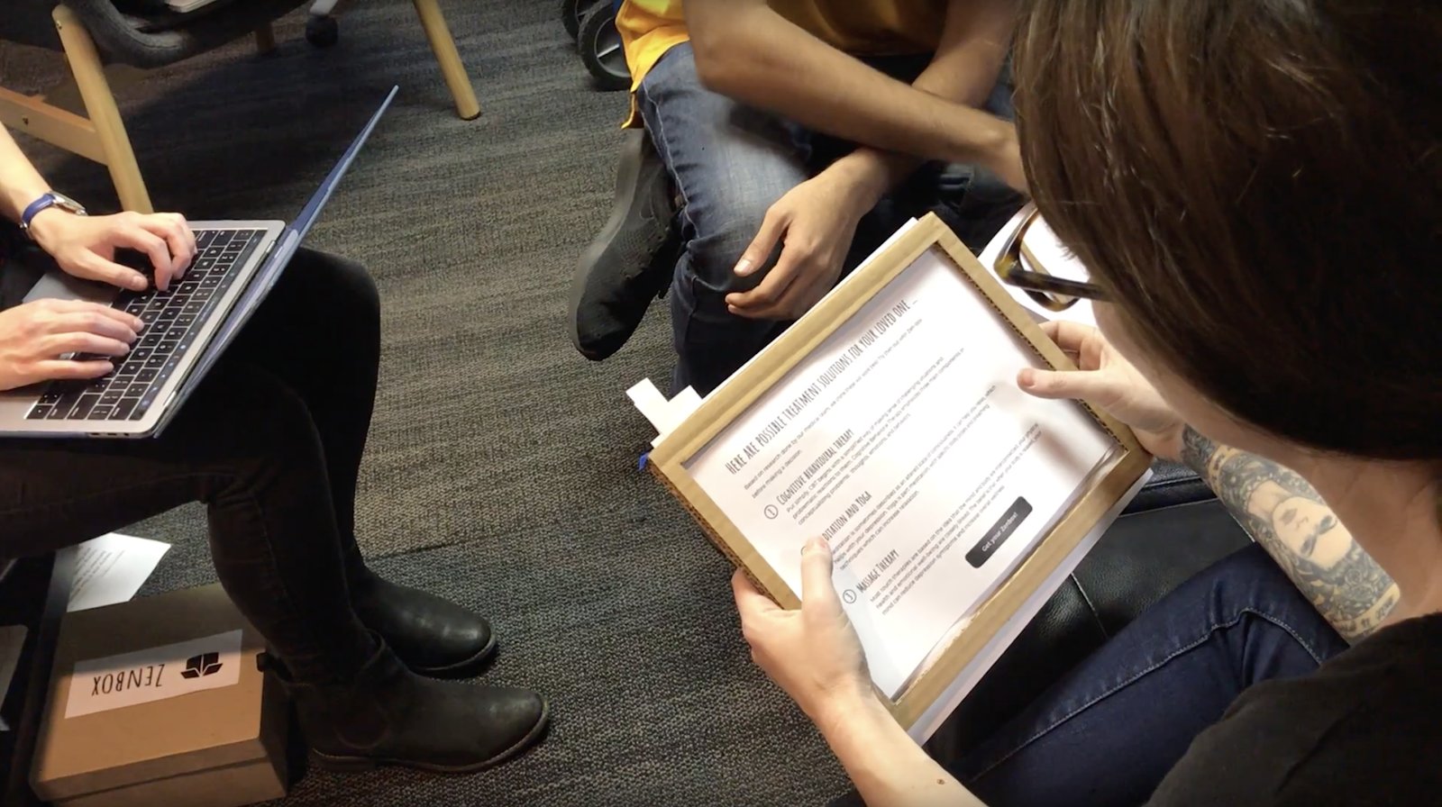
As we reviewed our storyboards, it became clear that each of them presented strengths. By combining them, we could develop a multi-faceted design response to depression, which is itself a multi-faceted and complex issue. In consultation with Premera we found that they were also excited by this approach. Our design response encompasses three main touch points:- Zenbox website – caregivers take a short quiz about their loved one and request a set of personalized treatment options
- Zenbox – caregivers receive activities for selected treatment options mailed to them in a box and evaluate which works best with their loved one
- Zenbox website – information to help caregivers and their loved ones determine healthcare coverage and costs, connect with a care provider and prepare for the first appointment
Prototyping
We created and tested paper prototypes and invision wireframes to examine both the conceptual framework of the product and usability errors. We recruited caregivers and people who have depression: providing us with perspective from both sides of the user groups and directed feedback from their personal experiences.
Specification
We created a final design spec for Zenbox which includes website information architecture, user journey, red lines, visual design, and branding.
Presentation to Premera
With our spec ready and Zenbox in hand, we went with our classmates to Premera to present our design ideas. Our team had half an hour with a room of Premera employees whose roles spanned business, design, customer experience, and management. This presentation helped us learn how to translate our research findings and design ideas in such a way that was relatable to a diverse audience.Insight: When in doubt, keep finding out!
As depression and the healthcare system are quite complex, we had a lot of learning to do. To complement our secondary research, we ran cultural probes to solicit stories and pictures responding to What does depression look like?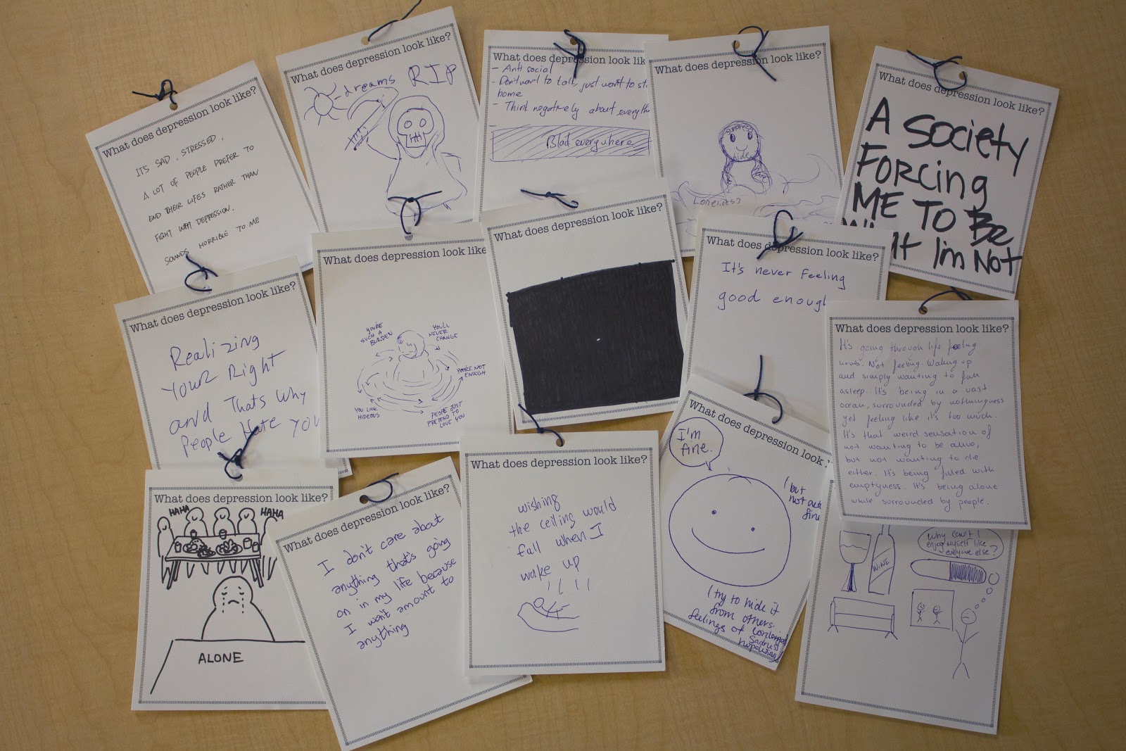 The responses we got made clear the gravity of the design space we were engaging with and demonstrated the possibility we had for a large impact. But as we were learning more and more about why people with depression do not seek care, we were still struggling to find the right design opportunity that included the caregiver.
The structure of our course had us moving into ideation, but we knew we needed to learn more. We took the time to connect with a few caregivers and people with depression and held short interviews.
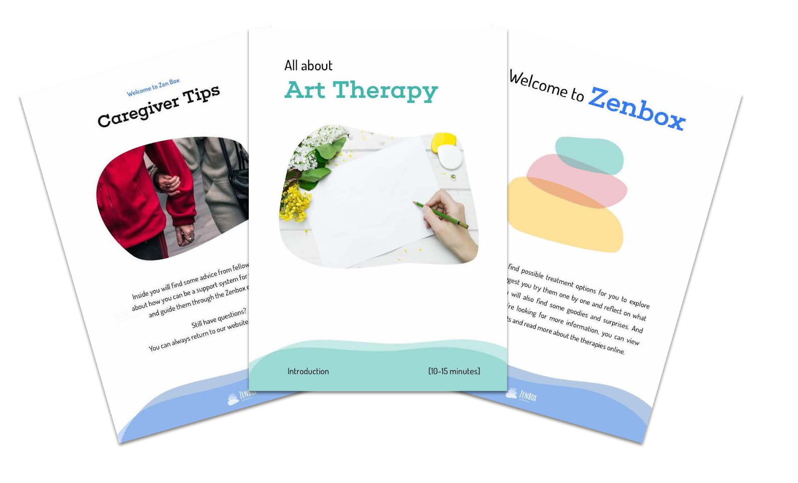 Our ah-ha moment came when one of our participants told us that after 4 years of work with a talk-therapist, she was introduced to yoga therapy. It was so impactful for her journey that she has decided to change careers and become a yoga therapist. This opened our eyes to alternative treatment options and eventually led us to a crucial aspect of our design: highlighting different types of therapy for depression and bringing to light insurance coverage.
Our takeaway – research doesn’t end because someone said that it’s time to move along in the design process. Research continues as your design is made: from prototype testing, usability research, reading, and conducting interviews. There’s always more to learn!
1 https://www.nimh.nih.gov/health/statistics/major-depression.shtml
2 https://www.ncbi.nlm.nih.gov/pmc/articles/PMC1494953/